
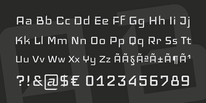
The work of Victor Kharyk called Iceland is a modular and a square webfont and it was designed to run on screens of minimum resolution. To do this, strokes are drawn vertically, and diagonal cuts are at 45-degree angle to ensure that they are easily read on low DPI screens. They are smooth and rounded as a way of achieving this goal.
Increased proportions and large size of text are used for the sake of better visibility. Specifically, shapes of the letter such as K, F and R enhance reading of the smaller versions while giving a clean and sharp look at larger sizes.
Uppercase letters are made thicker compared to the lower case letters and this is intentional to respect the traditional typographic styles, to facilitate the differentiation between the upper and lower case letters, and also to allow them to be reduced for use as small caps.
Iceland Font

License: Personal & Commercial Use!
Font Type: Free
Format: OTF, TTF
File Size: 21 KB
Total Files: 1


Leave a Reply